GOV.UK is a blue brand
Our core brand colours are Primary blue and Accent teal.
We’re building on the Primary blue already in place to support recognition and trust. Using it more consistently will make it a clear visual signature of GOV.UK.
Accent teal also sits alongside to add impact and help the brand feel more modern.
- Primary blue
- RGB 29 112 184
- #1D70B8
- Accent teal
- RGB 0 255 224
- #00FFE0

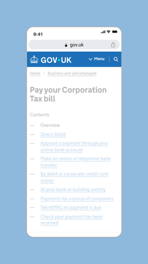
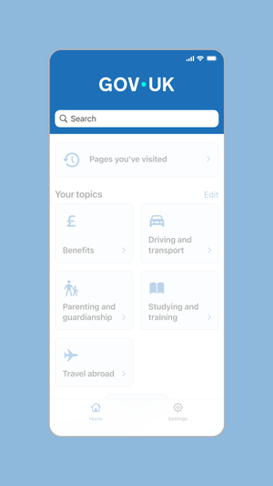
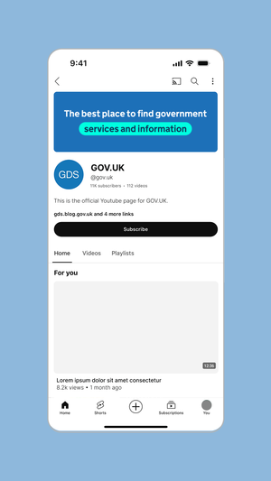
Coherency across channels
We lead with the Primary blue and Accent teal across all GOV.UK channels. From the blue header on web and app, to branded banners within social platforms, this aids brand recognition and establishes trust.
Indicative examples for illustrative purposes only.
Mobile web header
App header
YouTube profile
App splash screen
Video description of app splash screen
No audio. The dot leads a trail of other dots of various colours in a spiral towards the centre of a mobile screen, where it becomes the dot within the GOV.UK logo as it fades and pushes in.
At the bottom of the screen, the crown logo element is revealed by a circular iris effect at the bottom of the screen as the dots in the crown rise and fan out.
Colour accessibility
You must make sure that the contrast ratio of colours used meets Web Content Accessibility Guidelines (WCAG 2.2) success criterion 1.4.3 Contrast (minimum) level AA.
Incorrect colour usage
To maintain consistency across channels the colours within our palette should never be changed or altered. Exceptions to these recommendations must be approved by the brand team.
Do not use colour combinations that do not meet WCAG2.2 guidelines.

Do not create new colours.

Do not use too many colours within an application.

Do not mix colours to create gradients (single colour gradients are permitted for use over imagery).

Tailoring for GOV.UK channels
Each GOV.UK channel requires a different level of function and expression and therefore the palette has been tailored accordingly.
The following guidance details which palette can be used across web, app and social.