Maps
Map palette
Use colour thoughtfully in maps, choose a clear palette, limit colours, and ensure a 3:1 contrast ratio. Check for accessibility, particularly for visually impaired and colour blind users, and include a legend.
Combine colour with shapes, patterns, and labels to improve clarity.
Be aware that users may interpret colours differently, influenced by cultural or political associations.
The map palette has:
Blues
- Primary blue
- RGB 29 112 184
- #1D70B8
- Blue tint 25%
- RGB 86 148 202
- #5694CA
- Blue tint 50%
- RGB 142 184 220
- #8EB8DC
- Blue tint 80%
- RGB 210 226 241
- #D2E2F1
- Blue tint 95%
- RGB 244 248 251
- #F4F8FB
- Blue shade 10%
- RGB 26 101 166
- #1A65A6
- Blue shade 25%
- RGB 22 84 138
- #16548A
- Blue shade 50%
- RGB 15 56 92
- #0F385C
- Accent blue
- RGB 17 224 241
- #11E0F1
Magentas
- Primary magenta
- RGB 202 53 124
- #CA357C
- Magenta tint 25%
- RGB 215 104 157
- #D7689D
- Magenta tint 50%
- RGB 229 154 190
- #E59ABE
- Magenta tint 80%
- RGB 244 215 229
- #F4D7E5
- Magenta tint 95%
- RGB 252 245 248
- #FCF5F8
- Magenta shade 25%
- RGB 152 40 93
- #98285D
- Magenta shade 50%
- RGB 101 27 62
- #651B3E
- Accent magenta
- RGB 255 82 238
- #FF52EE
Reds
- Primary red
- RGB 202 53 53
- #CA3535
- Red tint 25%
- RGB 215 104 104
- #D76868
- Red tint 50%
- RGB 229 154 154
- #E59A9A
- Red tint 80%
- RGB 244 215 215
- #F4D7D7
- Red tint 95%
- RGB 252 245 245
- #FCF5F5
- Red shade 25%
- RGB 152 40 40
- #982828
- Red shade 50%
- RGB 101 27 27
- #651B1B
- Accent red
- RGB 255 94 94
- #FF5E5E
Greens
- Primary green
- RGB 15 122 82
- #0F7A52
- Green tint 25%
- RGB 75 155 125
- #4B9B7D
- Green tint 50%
- RGB 135 188 168
- #87BCA8
- Green tint 80%
- RGB 207 228 220
- #CFE4DC
- Green tint 95%
- RGB 243 248 246
- #F3F8F6
- Green shade 25%
- RGB 11 92 62
- #0B5C3E
- Green shade 50%
- RGB 8 61 41
- #083D29
- Accent green
- RGB 102 243 158
- #66F39E
Purples
- Primary purple
- RGB 84 49 159
- #54319F
- Purple tint 25%
- RGB 127 101 183
- #7F65B7
- Purple tint 50%
- RGB 170 152 207
- #AA98CF
- Purple tint 80%
- RGB 221 214 236
- #DDD6EC
- Purple tint 95%
- RGB 246 245 250
- #F6F5FA
- Purple shade 25%
- RGB 63 37 119
- #3F2577
- Purple shade 50%
- RGB 42 25 80
- #2A1950
- Accent purple
- RGB 186 74 255
- #BA4AFF
Teals
- Primary teal
- RGB 21 129 135
- #158187
- Teal tint 25%
- RGB 80 161 165
- #50A1A5
- Teal tint 50%
- RGB 138 192 195
- #8AC0C3
- Teal tint 80%
- RGB 208 230 231
- #D0E6E7
- Teal tint 95%
- RGB 243 249 249
- #F3F9F9
- Teal shade 25%
- RGB 16 97 101
- #106165
- Teal shade 50%
- RGB 11 65 68
- #0B4144
- Accent teal
- RGB 0 255 224
- #00FFE0
Oranges
- Primary orange
- RGB 244 119 56
- #F47738
- Orange tint 25%
- RGB 247 153 106
- #F7996A
- Orange tint 50%
- RGB 250 187 156
- #FABB9C
- Orange tint 80%
- RGB 253 228 215
- #FDE4D7
- Orange tint 95%
- RGB 254 248 245
- #FEF8F5
- Orange shade 25%
- RGB 183 89 42
- #B7592A
- Orange shade 50%
- RGB 122 60 28
- #7A3C1C
- Accent orange
- RGB 255 175 74
- #FFAF4A
Neutrals
- Black
- RGB 11 12 12
- #0B0C0C
- Black tint 25%
- RGB 72 73 73
- #484949
- Black tint 50%
- RGB 133 134 134
- #858686
- Black tint 80%
- RGB 206 206 206
- #CECECE
- Black tint 95%
- RGB 243 243 243
- #F3F3F3
- White
- RGB 255 255 255
- #FFFFFF
Using colour combinations on maps
Avoid using colour alone to convey information in a map, instead use colour in combination with:
- using different shapes and symbols
- differentiating size and thickness of lines or shapes
- using labels
- creating a legend (‘key’) to explain what colours, tints and patterns mean
When you choose colours for a map, think about how they help users understand the information. The colours need to be clear, logical, and accessible.
Use colours that make sense to your users, and make sure there’s enough contrast between them. Text should also have strong contrast against the background so it’s easy to read.
Do not assume everyone sees colours the same way. Colour meanings can change depending on culture or context. For example, some colours are linked to political parties in the UK. Always test your map with users to check how they understand the colours.
If you cannot get enough contrast, try breaking the map into simpler versions, adding outlines to separate areas, or giving the same information in a different format, like written content or a postcode tool.
Example
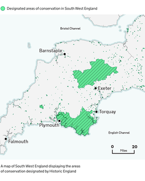
Indicative examples for illustrative purposes only.
Colours used in example
Points of interest
Data is shown in Accent green and outlined in Primary green. Labels show nearby population centres in Black.
- Accent green
- RGB 102 243 158
- #66F39E
- Primary green
- RGB 15 122 82
- #0F7A52
- Black
- RGB 11 12 12
- #0B0C0C
Base map
Land is shown in Black tint 95% and outlined in Black tint 80%.
Sea is shown in Teal tint 95% with coastal areas shown in Teal tint 80%.
- Black tint 80%
- RGB 206 206 206
- #CECECE
- Black tint 95%
- RGB 243 243 243
- #F3F3F3
- Teal tint 80%
- RGB 208 230 231
- #D0E6E7
- Teal tint 95%
- RGB 243 249 249
- #F3F9F9