Dot use examples
App splash screen
The app splash screen utilises the dot in motion to represent GOV.UK bringing together government services and departments, all in one place.
Long splash screen
Short splash screen
Video description of long and short splash screens
No audio. The dot leads a trail of other dots of various colours in a spiral towards the centre of a mobile screen, where it becomes the dot within the GOV.UK logo as it fades and pushes in. The crown logo is revealed by a circular iris effect at the bottom of the screen.
In the long version, the trail of dots moves in a wider spiral.
Illustration
The dot can be brought to life through animation in illustrations, adding personality and expression to moments such as app onboarding, or to tell visual stories within social.
Person
No audio. An animation of a person giving a friendly wave. Circles are used to draw the head and hand, while pieces of a circle are used to draw the shoulders and hairstyle.
Travel
No audio. An animation of luggage moving aross the frame. Suitcases are drawn as rectangles with rounded corners. Circles are used to draw wheels and luggage tags, while pieces of a circle are used to draw the handles.
Lock
No audio. An animation of a circle-shaped padlock opening and closing.
Onboarding
No audio. Animation of various circle-themed icons, including a speech bubble, notification bell, map pin and toggle switch.
Piggy bank
No audio. Animation of a circle-shaped piggy bank. Several coins drop into the piggy bank before it does a happy shake.
Social media
Within the context of social media, strong brand expression and impact are essential for capturing attention and driving engagement.
With content competing for visibility, our brand needs to stand out through more impactful visuals and dynamic motion.
To ensure consistency across all content, our dot graphic language should serve as a unifying anchor, reinforcing brand recognition and cohesion.
The dot provides a distinctive, flexible visual thread that ties together different content types, ensuring our brand remains instantly recognisable across content, thumbnails and profiles.
Social end frames
To build coherence across channels, our social end frames follow the same motion behaviour as the app splash screen.
Video end frame 16:9
No audio.
Video end frame 9:16
No audio.
Video end frame 1:1
No audio.
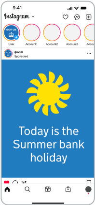
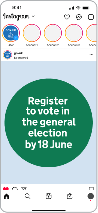
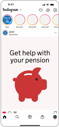
Video thumbnails
We can build on our dot graphic language to create engaging thumbnails that encourage user interaction.
Dot behaviours provide flexibility in how thumbnails can be created for a variety of content types, across a scale from informing to inspiring.
Thumbnails should always use the dot in a purposeful way.
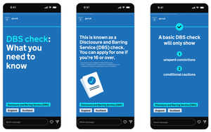
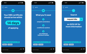
Indicative examples for illustrative purposes only.
From most informative to most inspiring

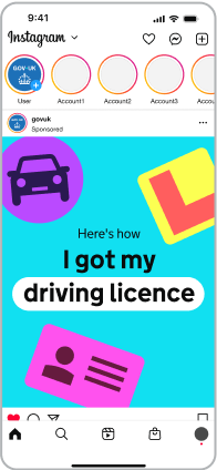
Get help with…

Influencer / presenter
Static dot examples
The dot can also be used as a static graphic, adding emphasis and helping guide users through content.
Indicative examples for illustrative purposes only.
Static dot storyboard
While it’s important to use the dot in a purposeful way, it can effectively guide user attention and break down information to enhance the overall experience.
Indicative examples for illustrative purposes only.
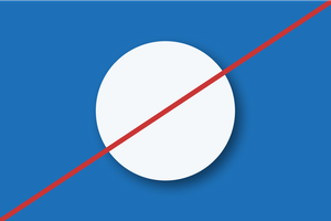
Incorrect dot usage
The dot has defined roles and behaviours, set out earlier in this guidance.
To keep things consistent, avoid the following:
Overuse
Do not overuse the dot.

Distortions
In static application, do not distort or skew the dot. In motion, it’s acceptable to distort the dot under some circumstances.

Stroke
Do not use stroke versions of the dot.

Crops
Do not crop the dot so that it becomes abstract. Ensure adjacent dots are visible to provide context.

Filters and effects
Do not apply shadows or gradients.