Accessibility
Accessibility across channels
Accessibility must always be considered when creating and using illustrations. While some channels are governed by more rigorous accessibility standards (for example, web), accessibility remains important across all platforms, including social media. Although technical requirements may vary by channel, the principle is the same: illustrations should be understandable by as many people as possible.
Alternative text (alt text)
On websites, images must include alternative text (alt text). Alt text is read aloud by screen readers and is displayed when images fail to load or when images are turned off.
Where possible, alt text should also be added to images used on social media platforms. Support for alt text varies between platforms and social media formats, but adding alt text where available improves accessibility for users of assistive technologies.
Alt text should:
- Describe only the essential visual information that cannot reasonably be included in the surrounding written content
- Be concise and meaningful
- Avoid repeating text that already appears in the page or post
Do not add alt text if the image is purely decorative and does not convey information.
For workflow purposes, alt text copy can be included in a text box alongside the image in tools such as Figma or Illustrator, ready for implementation when the illustration asset is delivered.
Decide if an image needs alt text, see the Web Accessibility Initiative alt decision tree.
Example alt text:
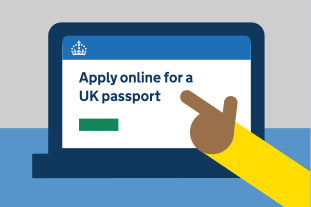
“A hand pointing at a laptop screen with the ‘Apply online for a UK passport’ page on GOV.UK open.”
Colour contrast and visual clarity
Illustrations should use sufficient contrast between colours and tones so that individual elements are clearly distinguishable.
Good colour contrast
- Helps users with low vision
- Improves legibility in poor lighting conditions
- Ensures content remains usable across different devices and screen settings
As an additional step, illustrations should be checked using colour-blindness simulation tools. This helps ensure that no important information becomes unclear or invisible for users with colour vision deficiencies.
Colour should not be the only way information is conveyed. Where possible, use additional visual cues such as labels, patterns, or shapes.
WCAG and social media
The Web Content Accessibility Guidelines (WCAG) 2.2 provide the recognised standard for digital accessibility and should generally be applied to any content that appears in a web browser, including social media.
The Public Sector Bodies (Websites and Mobile Applications) Accessibility Regulations do not apply to social media platforms unless paid-for advertising or promotion is used. However, the Equality Act 2010 still applies, and public sector organisations have a duty to make reasonable adjustments.
The key difference with social media is that organisations do not control the platform’s underlying code or interface.
As a result, accessibility efforts should focus on:
- The content: images, text, video and audio
- Clear language and structure
- Providing alternatives where possible, for example, alt text and captions
For detailed guidance on accessibility refer to the WCAG 2.2 guidelines.